//logicerror
//logicerror
//logicerror
unintended_behaviors {
yield
unexpected_results
}∆?

unintended_behaviors {
yield
unexpected_results
}∆?

//parentheticals {
_mobile slightly more optimized & is officially higher than "bad" on the user-experience scale. you're welcome.
_planning on adding a blog. words, thoughts, case study elaborations, etc.
_if things seem out of place, they likely are. still tweaking, excuse the mess.
}∆? ▉
" height="18px" id="ISemZDu1h" width="18px"/></svg>)

//logic error {
is: a small mid-atlantic-based studio focusing on brand identity & narrative design. an exercise in identity through multi-disciplinary approaches
i am: a writer & designer with nearly a decade of professional experience with visual design systems, photography, & written narrative construction.
}∆?▋
//services
//services
studio offerings {
visual: graphic design, photography, web design
narrative: copywriting, editorial, brand voice
identity: brand development, strategy
//programs & systems at use
adobe photoshop | adobe illustrator
adobe lightroom | affinity suite
framer | touchDesigner | macOS
windows | bit of linux
//strategy
logic error works with small brands & groups looking to build their identity through collaborative engagement with visual mediums - nurturing unintended behaviors, yielding unexpected results.
}∆?▋
▊
}∆?
//logic error {
//services
studio offerings {
visual: graphic design, photography, web design
narrative: copywriting, editorial, brand voice
identity: brand development, strategy
//programs & systems at use
adobe photoshop | adobe illustrator
adobe lightroom | affinity suite
framer | touchDesigner | macOS
windows | bit of linux
//strategy
logic error works with small brands & groups looking to build their identity through collaborative engagement using visual mediums - nurturing unintended behaviors, yielding
unexpected results.
}∆?▋
//services


1
2
3
4
5
6
.project_one { //name_industry.designation
dogfish.head_craft.brewery
>content = .brand_design .photography
>software = .adobe
>hardware = .mac .nikon/canon


1
2
3
4
5
6
7
8
9
10
.project_two { //name_industry.designation
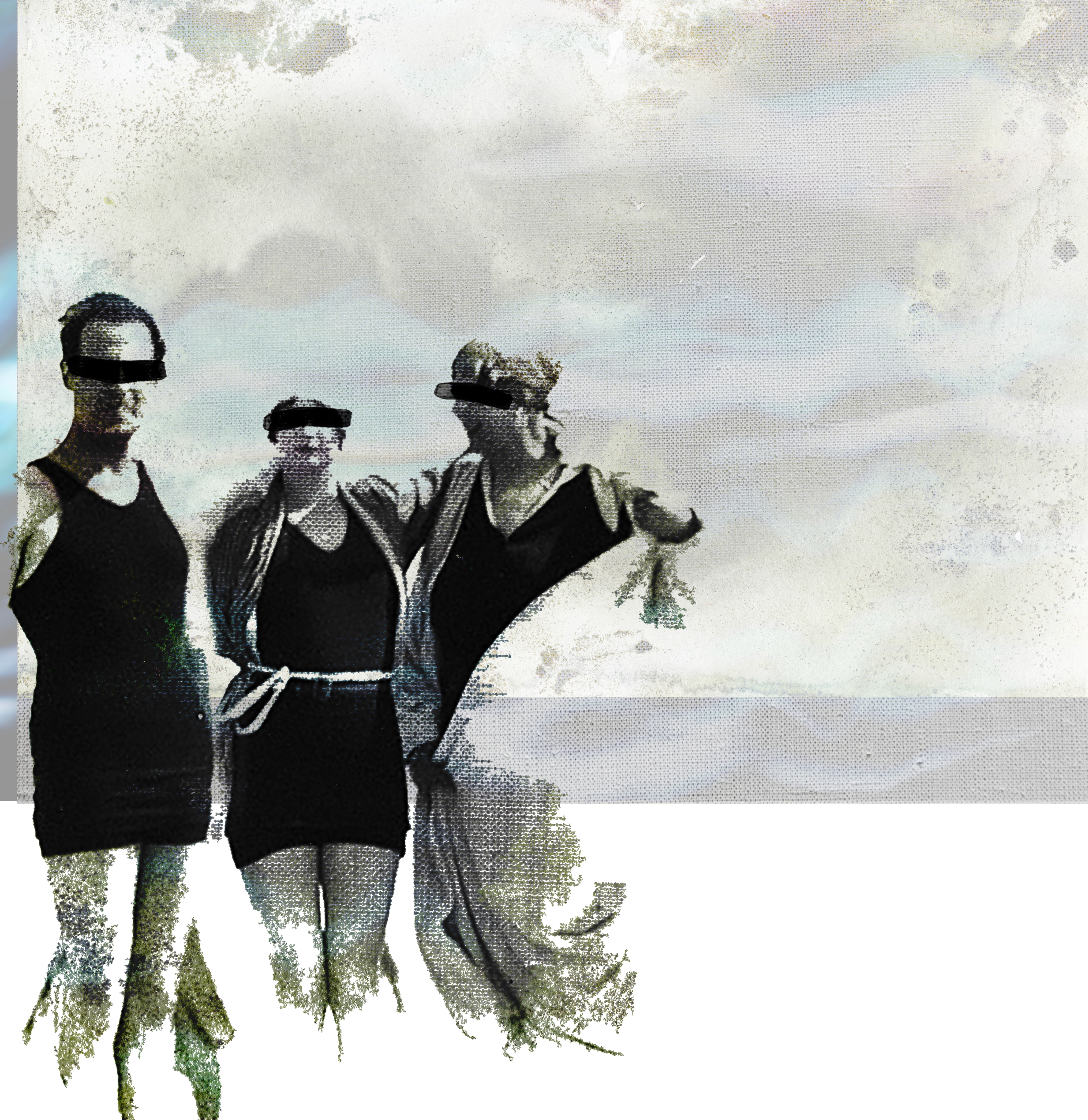
skate.rats_photo.series
>content = .photography
>software = .adobe
>hardware = .nikon_d300/n2000


1
2
3
4
5
.project_three { //name_industry.designation
cape.cod.leash.co_product
>content = .brand_dev
>software = .affinity .adobe .procreate
>hardware = .mac

1
2
3
4
5
6
7
8
9
.project_four { //name_industry.designation
ivy&rye_brick.mortar
>content = .brand_dev .photography .web
>software = .affinity .procreate
>hardware = .mac .lumix

1
2
3
.project_five { //name_industry.designation
property.pros_utility.service
>content = .brand_dev
>software = .affinity .procreate
>hardware = .mac

1
2
3
4
5
6
7
8
9
.project_six { //name_industry.designation
stm.productions_film.co
>content = .brand_dev .photography
>software = .affinity .adobe .procreate
>hardware = .mac
work inquiry
want to work together? same here. to help us land on the same page, send over a few details about yourself & your needs. we'll look over the particulars and get back to you within five business days

work inquiry
want to work together? same here. to help us land on the same page, send over a few details about yourself & your needs. we'll look over the particulars and get back to you within five business days.
unintended_behaviors {
yield
unexpected_results
}∆?